Let's be clear: a B2B website is not here to win design awards. It is a strategic commercial asset, engineered from the ground up to generate leads and drive revenue.
Your site must function like your best salesperson, one that works 24/7 to attract, educate, and convert your ideal customers. It is a tool for growth, and its success is measured in pipeline generated and deals closed. Nothing else.
Far too many businesses begin a website redesign focused on aesthetics. They get bogged down in endless, subjective debates about colours and fonts, completely losing sight of the only metric that actually matters: commercial performance.
Your website is not an online brochure. It is a critical piece of your sales and marketing infrastructure.
This guide is designed to move you beyond superficial design trends and focus on what works. We will cover the core principles of creating a digital platform that delivers a tangible return on investment. The process involves treating your website like a product, one that is continuously improved based on hard data, not opinions. Every decision, from the navigation structure to the copy on a button, must serve a clear business objective.
This structured approach can be broken down into three core phases:
This simple, revenue-focused process for designing a B2B website is illustrated below.
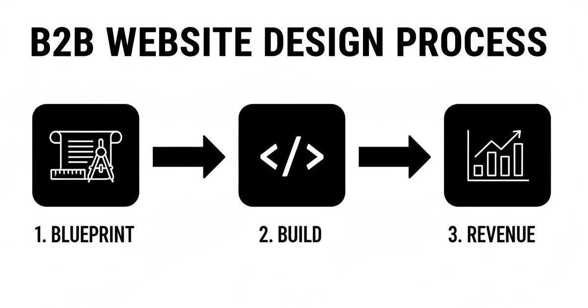
This linear flow reinforces a simple truth: successful outcomes are born from disciplined strategy, not creative whimsy.
As a marketing consultant and paid ads specialist, I see firsthand how a strategically designed website becomes the engine for growth. It is the perfect destination for highly targeted ad campaigns, it nurtures leads with insightful content, and it integrates smoothly with your sales process. When designed correctly, it becomes your most valuable commercial asset.
Before a single pixel gets designed, a high-performing B2B website needs a rock-solid commercial blueprint. This is, without question, the most critical part of the entire project, yet it is the one most founders and marketing teams rush through or skip entirely. Budget is naturally part of that blueprint - our guide on how much a website costs in the UK gives realistic 2026 pricing to plan against.
This is not about picking colours or fancy layouts. It is pure strategy, built on hard data and commercial goals.
Get this stage right, and you are engineering a sales asset from day one. Get it wrong, and you are guaranteed to build an expensive online brochure that does little more than collect dust, failing to generate leads or fill your sales pipeline. The whole process begins by looking inward at your business and outward at your market.
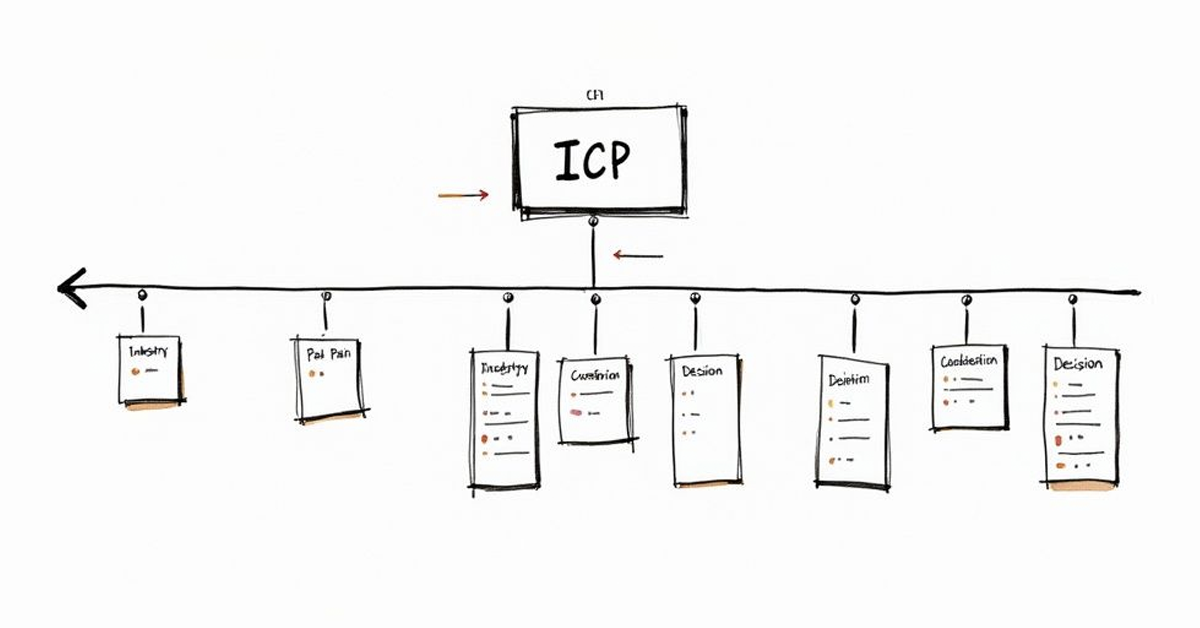
Your website cannot be for everyone. If you try to speak to everybody, you end up speaking to nobody. The very first job is to get absolute clarity on your Ideal Customer Profile (ICP). This is not a fluffy persona exercise; it is a forensic look at your most profitable, successful, and best-to-work-with customers.
The goal is to build a website that speaks their language, addresses their specific problems, and makes them feel understood.
A proper ICP analysis for a website project needs to document:
Your website must answer the questions your ideal customer is asking at every stage of their buying journey. If you do not know who that person is and what they need, you are simply guessing.
Once your ICP is crystal clear, you can map their journey from being vaguely problem-aware to becoming solution-ready. The B2B buying cycle is not an impulse purchase. It is long, often involves a committee of people, and is driven by cold, hard logic and financial justification. Your website has to support this complex dance.
A typical journey might look something like this:
Your sitemap and navigation should be a direct reflection of this journey, guiding visitors smoothly from one stage to the next without any friction.
Finally, the blueprint must define what success actually looks like in clear, quantifiable numbers. This is what turns the project from a cost centre into a revenue-generating investment. Vague goals like "improving our online presence" are completely useless.
Your objectives must be specific and tied directly to business outcomes. For instance:
Setting these targets from the outset ensures every design and development decision is weighed against its ability to hit those numbers. This strategic rigour is what separates a successful project from a failed one. For more on this foundational work, you can explore what marketing consultancy actually involves and how it provides this critical clarity.
By nailing this blueprint, you create a framework for building a website that does not just look professional, it actively grows your business.
With your commercial blueprint locked in, it is time to translate that strategy into a real, tangible user experience (UX) and user interface (UI). This is where we shape the digital environment that guides your ideal customers from mild curiosity to a serious sales conversation.
In B2B, this is not about flashy animations or chasing trends. It is about building trust and making it easy for people to make complex, high-stakes decisions. The goal is a clean, professional interface that conveys authority and credibility.
A great B2B site feels less like a sales pitch and more like a consultation with a trusted expert. It anticipates questions, removes friction, and builds confidence with every click. Every design choice must serve this commercial purpose.
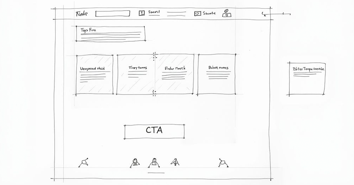
When a busy decision-maker lands on your page, you have seconds to show them what matters. A strong visual hierarchy does exactly that, guiding their attention precisely where you want it to go and creating a clear path through your message.
This is not just about making things look good; it is a powerful tool for communication and conversion.
Here is how to build one that works:
A cluttered website screams a lack of confidence. Strategic use of whitespace, on the other hand, signals authority and makes your core message impossible to ignore. It is one of the most powerful, yet overlooked, tools in B2B website design.
If potential customers cannot find what they are looking for fast, they will simply leave. In the B2B world, people are often researching on company time and have zero patience for confusing menus or illogical site structures. Your navigation has to be simple, logical, and totally predictable.
Keep your primary navigation menu limited to five to seven essential items. These should be the core pages a prospect needs to evaluate your business: "Services," "Case Studies," "About," and "Contact" are typical examples. Avoid internal jargon and stick to clear, universally understood labels. The site structure you defined in your blueprint should directly inform these choices.
Designing a B2B website today means building for every device. While many B2B buyers conduct deep research on their desktops, a huge number will first encounter your brand on a mobile phone, perhaps after seeing a LinkedIn ad or clicking a link in an email.
A clunky mobile experience is a guaranteed way to lose a potential lead before you have even had a chance to make your case.
Beyond responsiveness, accessibility is a commercial and ethical non-negotiable. Making your site accessible to users with disabilities does not just do the right thing; it expands your potential market and genuinely improves the experience for everyone.
At Gilkes Media, our professional website design and development services build these foundational principles into every project from day one. We focus on creating clean, intuitive, and commercially effective platforms that act as powerful assets for lead generation and business growth. The result is a website that not only looks professional but works tirelessly to support your sales objectives.
A great-looking website is commercially useless if it is slow, insecure, or invisible to Google. The technical build is not some back-end chore for the IT department; it is the very foundation of your commercial strategy.
Accessibility is part of a solid technical build too, not an afterthought - see our website accessibility guide for what UK sites are actually required to get right.
This is the point where your website’s potential to generate revenue is either locked in or completely undermined.
Get the technical build right, and you have a reliable, high-performing asset that supports every sales and marketing effort you make. Get it wrong, and you are left with a digital liability that actively costs you leads and chips away at your brand's credibility.
One of the first big decisions is picking the right technology to build your website on. This is not about chasing the newest or trendiest platform. It is a strategic decision based on your specific needs for scalability, security, and who will be managing it day-to-day.
For B2B companies, it usually comes down to two main routes:
For most businesses I work with, a professionally built and managed WordPress site is the most pragmatic and commercially sound choice. It empowers your marketing team to manage content efficiently without needing to call a developer for every minor update.
Website performance is not a "nice-to-have", it is a direct driver of conversion. Slow-loading pages do not just frustrate potential customers; they get actively penalised by search engines like Google. The key is to focus on Core Web Vitals, a set of specific metrics Google uses to measure real-world user experience.
We go into what actually moves these metrics, and what it costs your business when they slip, in Website Speed and Core Web Vitals.
The most critical of these is Largest Contentful Paint (LCP), which measures how long it takes for the main content of a page to load. In the UK's competitive web design industry, where projected revenue stands at £658.2 million, B2B clients demand tangible proof of ROI. This means targeting an LCP of under 2.5 seconds is non-negotiable, as every second of delay can cause a 7% drop in conversions. Given that 81% of consumers link a website's professionalism directly to brand trust, these technical details have a massive commercial impact. You can find more insights into the UK web design services industry on IBISWorld.
A slow website sends a clear message to potential clients: "We do not pay attention to the details." In B2B, where trust and credibility are everything, that is a message you simply cannot afford to send.
Search Engine Optimisation (SEO) has to be baked into the website from the very beginning, not bolted on as an afterthought. A technically sound site is one that search engines can easily crawl, understand, and ultimately, rank.
This means getting the on-page fundamentals right during the build phase:
Here is a quick rundown of the key technical benchmarks your B2B website absolutely must meet.
This table summarises the non-negotiable performance metrics your website needs to hit. Falling short on any of these does not just create a poor user experience; it directly impacts your ability to generate leads and revenue.
| Metric | Target Benchmark | Commercial Impact of Missing Target |
|---|---|---|
| Largest Contentful Paint (LCP) | Under 2.5 seconds | Significant drop in conversion rates and higher bounce rates. |
| Mobile-Friendly Score | 100% Pass | Alienates a large portion of your audience and hurts search rankings. |
| HTTPS Security | Fully implemented | Erodes visitor trust and triggers browser warnings, killing conversions. |
| Crawlability | No major errors in Google Search Console | Key pages may not be indexed, making them invisible in search results. |
Paying close attention to these details ensures your new website is not just a beautifully designed brochure. It becomes a high-performance commercial tool, ready to attract and convert your ideal customers from day one.
Your website’s design and technical build are the foundations, but your content is the engine that drives commercial results. Without a clear strategy for what you are going to say, and how you will convince visitors to act, even the most beautiful B2B website will fall flat.
Content is what answers your prospect's questions, builds your authority, and gently guides them through their often complex buying journey. At the same time, Conversion Rate Optimisation (CRO) is the science of making it easy for them to take the next step. The two have to work in perfect harmony.
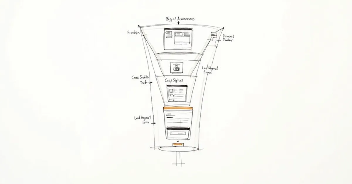
Great content meets buyers exactly where they are. Someone just realising they have a problem needs entirely different information from someone actively comparing vendors. By mapping your content to their buying journey, you create a smooth, logical path from awareness right through to decision.
Attracting visitors is one thing, but a strong conversion strategy is what turns that traffic into qualified leads. Every page on your site must have a clear purpose and a primary call-to-action (CTA) that nudges the user towards that goal.
A well-designed CTA is specific and focuses on the benefit. Ditch the vague "Submit" button and use action-oriented language like "Get My Free Proposal" or "Schedule My Demo." The data does not lie: research shows an intuitive user interface can boost conversion rates by 200%, so absolute clarity is essential.
People do not convert on websites they do not trust. Building credibility is not just a feature; it is the entire foundation of B2B lead generation. Every testimonial, case study, and client logo you display is another deposit into that trust account.
B2B buyers are risk-averse. They need to see that other businesses, just like theirs, have already succeeded with your solution. This is where social proof becomes your most powerful conversion tool.
Effective social proof includes things like:
When it comes to capturing leads, your forms have to be frictionless. Only ask for the information you absolutely need right now. A long, complicated form is a guaranteed conversion killer. For a simple demo request, you probably only need a name, company, and email address. You can always gather more details later in the sales process.
Finally, a crucial piece of the puzzle is creating dedicated landing pages for your paid advertising campaigns. As a paid ads specialist, I see millions of pounds wasted by businesses that send expensive traffic from Google Ads or LinkedIn straight to their generic homepage. It is a huge mistake.
A landing page has one job: to convert visitors for a specific offer. That is it. It should have a single, crystal-clear CTA, zero distracting navigation links, and messaging that perfectly mirrors the ad the user just clicked. This alignment ensures every pound of your ad spend is working as hard as possible to generate a measurable return.
A site is never really "done" at launch - our website maintenance checklist covers the upkeep most UK businesses end up skipping.
Getting your new B2B website live is the starting line, not the finish. It is a common mistake. Too many businesses treat the ‘go-live’ date as the end of the project, breathe a sigh of relief, and move on.
In reality, that is day one of its commercial life. Your website is not a static brochure; it is a dynamic sales tool that must evolve based on real-world user data to actually deliver a return.
This means you have to shift from a project mindset to a cycle of continuous improvement. The goal is to stop relying on assumptions you made during the design phase and start making decisions driven by hard data.
A smooth launch is a planned launch. Rushing this final step can undermine months of hard work, leading to technical glitches, lost tracking data, and a terrible first impression on visitors. A disciplined pre-launch check is not just a nice-to-have, it is non-negotiable.
This is not about just making sure the pages load correctly. It is a final, rigorous review to ensure every commercial and technical element is primed for performance from the moment you flip the switch.
Your checklist should cover these critical areas:
Once you are live, the focus pivots to measurement. Vague metrics like "traffic" are useless vanity numbers. You need to monitor the key performance indicators (KPIs) that directly reflect your website’s commercial impact. This is where a solid measurement framework, configured correctly in your analytics platform, is absolutely essential.
Your framework should be built around the commercial metrics that actually matter to your business:
Data tells you what is happening, but insight tells you why. Your goal is not just to collect numbers. It is to understand the user behaviour behind them so you can make informed, commercially-driven improvements.
By analysing this data, you can start asking the right questions. Why is the conversion rate on one service page double that of another? Which traffic sources are driving the most cost-effective leads? Answering these questions forms the foundation of your optimisation strategy.
If you need to get deeper into turning numbers into profit, our guide on paid search analytics offers a detailed framework. This continuous cycle of measuring, analysing, and improving is what ensures your website does not just launch well, it evolves to become your most powerful lead generation engine.
Founders and marketing managers often ask the same questions when planning a new B2B website. Let's get right to the practical answers you need, so you can move forward with confidence and focus on what really matters: getting commercial results.
This is the big one, and the honest answer is: it varies massively. But you must avoid getting fixated on the lowest possible price.
A basic brochure-style site from a freelancer might start in the £3,000-£5,000 range. For a more strategic, conversion-focused website from a specialist consultant or a small, sharp agency, you are typically looking at somewhere between £10,000 and £25,000. If your project involves complex custom integrations or unique functionality, the cost can easily climb past £40,000.
The right question is not "How much does it cost?" but "What return will this investment generate?" A cheap site that fails to produce leads is far more expensive in the long run than a strategic build that actually fills your sales pipeline.
For a properly planned B2B website, a realistic timeline is 10-16 weeks from our first strategy session to the day it goes live.
That schedule is not just pulled out of thin air. It generally breaks down into:
Trying to rush this is the single most common mistake I see. It almost always leads to a poor outcome because it forces you to cut corners on the critical strategic thinking at the start of the project. Get that wrong, and everything else that follows is built on a shaky foundation.
For over 90% of B2B companies I speak with, a professionally built WordPress website is the smartest commercial decision. It gives you the best blend of flexibility, control for your marketing team, and overall cost-effectiveness. The huge ecosystem of plugins and developers means it is far easier to find support and add new features down the line.
A fully custom build should only be on the table if you have a highly specific, business-critical requirement that an existing platform simply cannot handle. Think unique client portal functions or complex, proprietary data integrations. For most businesses, it is just an expensive and unnecessary distraction.
At Gilkes Media, I work directly with you to build a website that functions as a powerful commercial asset, engineered for lead generation and ROI. If you are ready for a strategic approach that prioritises business growth, let's talk.
Honestly, they are two sides of the same coin. You cannot have one without the other.
Excellent functionality is useless if the design looks unprofessional and untrustworthy, as it will simply fail to convert visitors. On the flip side, a beautiful design that is slow, buggy, or confusing will just frustrate potential customers and send them straight to your competitors.
The best B2B websites strike a perfect balance: a clean, credible aesthetic combined with intuitive functionality that makes the buyer's journey smooth.
Ready to build a B2B website that delivers real commercial results? At Gilkes Media, we are senior marketing consultants, not a large agency. Our hands-on, performance-driven approach means we combine strategic insight with accountable execution to create websites that generate high-quality leads and drive growth.
Book a free consultation today to discuss your project. Find out more at https://gilkesmedia.co.uk.